Introduction
A definite relationship exists between typography and advertisement. A brief survey of any billboard, newspaper, poster or any other advertisement demonstrates that the use of typography to pass the advertisement’s information is possibly the most important aspect of advertisements of certain types. The main message that a business entity is looking forward to advertise often appears bold, enlarged, colored and highlighted to ensure readers do not miss it. This becomes so appealing and attractive to the target audience who are drawn to the visual aspect of the advert.
There are several elements that come together to make a good advertisement. These include color, location, design and typography. It is naïve to assume that visual advertisements would not be without the use of text. There are certain worldwide brands that have established themselves so well that the appearance of their logo is all that is needed. Nike’s tick, Adidas’ three bars, Microsoft’s flag and Apple’s apple are excellent examples of this.
This essay takes a look at such a brand, but one that uses typography as its core element: the logo of the Coca Cola Company. This entity has been in existence since the eighteenth century, and still continues to be the best selling beverage in the world. The Coca Cola brand is one of the most recognizable brands in the world today.
Amazingly, Coca Cola has maintained the original taste and chemical formula of their soft drink, and the original design of their first logo, as it was designed by Pemberton. John S. Pemberton, founder of the Coca Cola Company, and creator of the original formula of the world’s most famous soft drink, designed the logo himself using the Spencerian script. This paper examines how the use of typography in the creation of the design has helped the company market itself into what it is today.
What is typography?
Before further analysis of the relationship between typography and advertisement is carried out, it is important to know the proper definition of typography. Typography refers to the art of communicating vividly and simply through the use of type.
What is advertisement?
Advertising is a non-personal communication for an organization and the products it offers. It is propagated to a target audience by use of mass media such as magazines, television, public transport, newspapers, direct mail, catalogues and outdoor display. Most companies often advertise their products as items that meet a certain need of the customer. Coca cola, for example, has always sold its products as a refreshing beverage, hence the frequent use of ice, water bubbles and snow to suggest freshness, in its advertisements.
Understanding Coca Cola’s advertising strategy
From the time the company was formed, a monumental effort was put in by the management to ensure marketing of their product was excellent6. After a pharmacist called Asa Chandler had bought all the shares of Coca Cola in 1891, he formed the Coca Cola Company and began concentrating on marketing the product in as many states as was possible at that time. Soon, the sales of Coca Cola were rising. By 1893, the company was selling 50,000 gallons a year. It soon expanded from Atlanta, Georgia to Dallas, Chicago and Los Angeles.
The focus on marketing is a business strategy that is still at the heart of Coca Cola’s strategic plans today. The Coca Cola Company now focuses on maintaining the product as the world’s top beverage.

It has created a cult-like aura around their product, presenting it as the only beverage able to satisfy a customer and quench thirst.
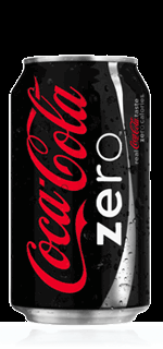
The success of Coca Cola as a brand is centered on its logo. Coca Cola has been able to make its logo one of the most recognizable logos in world business. The use of red and white color and the calligraphic text makes the brand instantly recognizable from the business streets of New York to the dusty roads in a Kenyan village. By pushing their product to all corners of the world, Coca Cola has created a soft drink that has remained the top selling soft drink in the world for over half a century.
Typography
This section analyzes the use of typography as used in Coca Cola’s advertisements. The font used in its adverts as well as the logo’s font shall be analyzed in greater detail. Also, the link between typography and advertising shall be discussed in greater detail. Finally, response from viewers of Coca Cola advertisements, over the years, will be sampled.
A Visual Analysis
Research indicates that Coca-Cola adverts have spread over a period of at least 100 years. The advertisements date back right from late eighteenth century to early nineteenth century. This clearly reveals how people preferred the company’s products by then.
Similarities
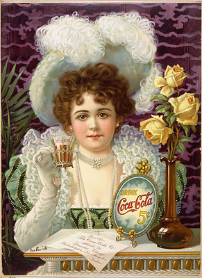
Both advertisements use different skills in typography to pass their message. In the first advertisement, the only written part of the advertisement is the Coca Cola logo, highlighted in their usual red against a blue background. The use of contrast when displaying text attracts the consumer’s eye to the name of the product first.
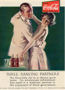
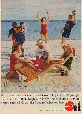
In the second advertisement, typography plays the most important role in conveying the advertisement’s message. The main message of the advertisement is placed at the top of the poster to attract maximum attention. The third picture shows an element of romance and enjoyment among young people who seems to be relaxing and also playing. Beside them, there is a bottle of Coca-Cola drinks and another bag with the brand’s label. This too attracts the viewer’s attention. Therefore, these three adverts associate the people in the pictures with Coca-Cola.
The second similarity is the use of color to highlight the product. Coca Cola’s logo is textual in nature, and it is therefore important to draw the client’s attention directly to it. In both adverts, the use of the color red helps the adverts’ creators to lead the customers’ eyes to the product’s name. If the font was not placed against such a contrasting background, it is easy for a customer to assume that the first advertisement is advertising a beach resort while the second one is the advertisement of a transport company.
Difference
The main difference in the advertisements lies in the layout of the pictures. Although they both portray how coke refreshes a person that takes it, the first advertisement concentrates more on visual interpretation than on a written description of the intended message. In 1937, people were not used to the use of pictures to advertise and therefore depended more on written explanations to get more information about a product. Therefore, the logo is more conspicuous in the second case than in the other two that seem to emphasize the users of Coca-Cola rather than the written logo.
Font
Type and history
The font used in the Coca Cola logo is known as Spencerian script. This script was named after Platt Rogers Spencer, the man credited for developing the font. By the time the Coca Cola logo was created in 1886, America was in the middle of the ‘golden age’ of ornamental penmanship.
Being one of the most successful fonts at the time, it is not surprising that Pemberton chose to use it when creating Coca Cola’s logo.
Why the font was used
As mentioned above, the font was extremely popular at the time and was therefore used often by companies and individuals. According to research, Pemberton’s partner and bookkeeper, Frank M. Robinson, suggested that the two Cs in ‘Coca Cola’ would look stylish if designed well. This is how the product was named. After this, Pemberton went ahead and designed a logo using a popular font at the time. By doing so, Pemberton ensured that customers could easily recognize and continue buying his product.
What the font does
Today, the font has been associated with Coca Cola so much that it is not conceivable to have a different logo with a different font. The curls in the Cs and the red color that Coca Cola uses are directly associated with the product. This font helps to create a mental link between a product and the advertisement. There have been several logos that have been created using Spencerian script against a red background. Every time one sees this, the first thing that comes to mind is not the product being advertised by the text but Coca Cola. The font leaves a mental imprint of the product in consumers’ minds.
Its significance in advertisement
The main significance the font has in the advert is creation of the link between the logo and the product or message. Just as in the adverts reviewed above, typography has been used to highlight the important parts of the message while other aspects are left to form the background of the image. The significance of Spencerian script in the Coca Cola logo is the secret to their continued success over the years – they create a link between the advert and the product. Although there are numerous beverages made from cola, the Coca-Cola brand can be easily distinguished from the rest due to its distinct typeface.
Link between typography and advertising
Based on the case of Coca Cola, there are two main aspects of typography that make it a necessity in advertising. First, typography allows advertisers to pass the message they intend to clearly. They do so by highlighting the text, making it bold and placing it in a background where contrast gives maximum attention to the message. The best advertisements are those that pay close attention to the typography and organize it in a manner that best passes the message across.
Secondly, typography draws the customers’ attention to a product. Using the case of Coca Cola, the unique text in the logo is always placed against a contrasting background. Coca cola is always very careful not to use colors that customers may not be familiar with. Thus, they prefer to use the colors their customers are conversant with which are white, black and red. By doing so, no matter what the subject of the advertisement is, customers can see that the advert is about Coca Cola.
Response from viewers
The responses highlighted here are based on responses given by viewers of Coca Cola advertisements between the eighteenth and the twenty first century. The first aspect that stands out in their responses is their love for Coca Cola as a brand and their admiration for good advertisements the company always comes up with. This is an indicator that most of these readers always look for and look forward to seeing the next Coca Cola advertisement.
The general feeling of admiration towards Coca Cola advertisements is a show that Coca Cola Company has been able to use the advantages of proper typography correctly. The adverts are presented in such an emotional manner such that viewers like and connect with them. An event that precedes the ad may create this emotion. When viewers see the ad, they join the actors in the ad into experiencing happiness, enjoyment and love. Experiencing any kind of emotion persuades the viewer into going for the brand.
The other aspect that stands out from their responses is a distinct connection between the advertisements and a season in their lives. This means that Coca Cola has found a way to link seasons like Christmas, Easter and summer to different experiences that the company gives its customers. This is a sign that Coca Cola uses typographical and visual effects together to reach out and touch their customers in a personal way.
Conclusion
There is a distinct link between advertising and typography. If an advert is able to use typographical skill to convey messages correctly, there is a higher chance that customers will notice the product and purchase it. Over the twentieth century, many companies like McDonalds, Marlborough, Ford, Nike and others have perfected the art of using the correct typographical skills to perfect their advertising. It is not a coincidence that they are very successful companies.
Bibliography
Bergsland, David, Practical font design. NY: Radiqx Press, 2010.
Bodden, Valerie. The Story of Coca-Cola. Madison, Wisconsin: The Creative Company, 2008.
Bohn, Willard. Modern Visual Poetry, Cranbury, NJ: University of Delaware Press, 2001
Crookedbrains, Coca Cola’s advertisements spread over a century, 2008. Web.
D’Angelo, Janet, Spa Business Strategies- A Plan for Success, NY: Cengage Learning, 2009
Garrett, Franklin, M. Atlanta and Environs: A Chronicle of Its People and Events, 1880s-1930s. Athens, Georgia: University of Georgia Press, 2011.
Jones, John, P. The advertising business: operations, creativity, media planning, integrated communications. NY: SAGE, 1999
Keller, Kevin Lane. 2000. The Brand Report Card. Harvard Business Review, 2000: 7-8.
Loken, Peter, Amy Voytilla, Matt Bach, and Sivika Sirisanthana. 2008. Advertising and the Visual Medium, January, Web.
Robinson, Martha. 2001. “Developing Spencerian Penmanship at Home.” Homeschoolchristian. Web.
The Coca-Cola Company, History of bottling, 2011. Web.
The Coca-Cola Company, Product information: Products, 2011. Web.
White, Alex, W. Advertising design and Typography. New York: Allworth Press, 2006.