Introduction
This paper presents a detailed comparison and contrast of two architectural projects – the Christian Science Center extension (comprised of the Sunday School building, also known as Reflection Hall (235 Huntington Avenue), the Colonnade building (101 Belvidere Street), the 26-story Administration building (177 Huntington Avenue), now named after its address, and the reflecting pool and public spaces of its open plaza) and West Wing addition to the existing building of the Museum of Fine Arts (also known as the Linde Family Wing for Contemporary Art). First of all, these projects will be described based on personal observations and impressions. Further, they will be analyzed and compared in terms of planning and organization of spaces, structure, materials used, functions, and circulation. Finally, at the end of this paper, a conclusion based on the contrast of the two projects will be made.
Christian Science Center Extension
The initial Christian Center complex included a group of three buildings, the original Mother Church, the Church Extension and the Christian Science Publishing House, which were built in 1894, 1906, 1934 accordingly. In the second half of the 1900s, the complex was expanded to include four more buildings and some public spaces. Based on the numerous street addressed different buildings of the Center have, one may conclude that the complex occupies a rather large territory. However, the buildings take up a smaller part of it, as most of the land around the Center is open space. In total, the size of the territory occupied by the complex is over fourteen acres (Boston Landmarks Commission 3).
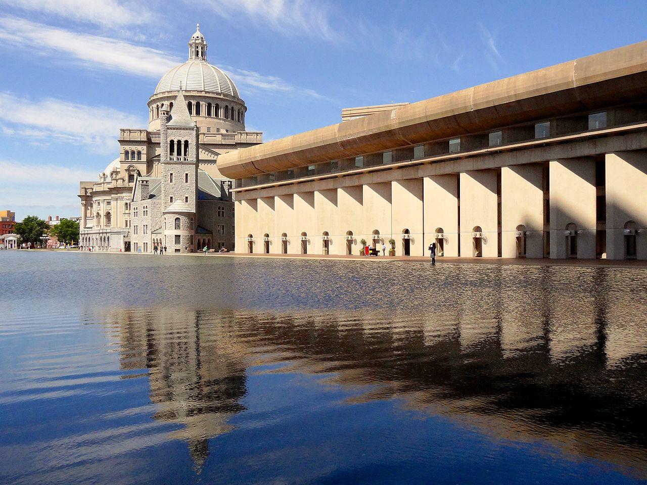
One of the most noticeable aspects of the Center and its planning was its geometry. The place can be characterized by the sharp and straight lines and geometrical shapes – a circle of the fountain, the rectangular shape of the reflecting pool, and the triangular open spaces outlined by Massachusetts Avenue, Clearway Street, Dalton Street, Belvedere Street, and Huntington Avenue. Besides, in my opinion, even without knowing anything about the complex and its buildings, any observer would be able to tell which additions of the complex are older or newer than the others. Compared to the Mother Church, the Colonnade building and the Reflection Hall have a much more modernistic design. They can be distinguished due to multiple repetitions of the elements in their structure so that multiple spaces are added to the overall constructions. This choice of design is likely to have been made in order to enrichen the aesthetic aspect of the buildings. In particular, both of the buildings with a large number of repetitive patterns comprised of thick and thin lines and light and dark spaces within the structure are located close to the reflection pool (see Image 2). Due to the mirror effect provided by the still water in the pool, the complexity of the styles of the buildings is enhanced and multiplied. Fact that the word “reflection” is present in the title of the pool and the Hall, one may assume that this was the ultimate ideal of the architect to create a complicated, yet sharp and clean composition of geometrical shapes and figures and enhance its visual effect with the help of the water in the Reflection Pool.
The Museum of Fine Arts – West Wing (the Linde Family Wing for Contemporary Art)
The West Wing addition to the Museum of Fine Arts in Boston was opened in 1981 (MFA par. 10). The Wing incorporates a large gallery space designed to host exhibitions; it also includes multiple shops and restaurants and an auditorium (MFA par. 10). The overall area around the Museum has a lot of open space with densely planted trees. The building itself has quite a complicated structure incorporating multiple spaces with different functions. However, all of these additions are out together in a wholesome structure. The external architecture of the building looks simplistic due to the multiple straight lines and correctly shaped spaces. In general, the shape of the Museum building is rectangular, and it is complicated by multiple additions that were created at different periods. The West Wing can be recognized for its minimalistic style and a very clean-cut structure on the outside. At the same time, on the inside, the construction is truly fascinating.
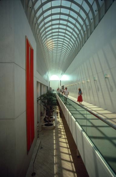
Visiting the gallery space, I have noticed that the architecture was designed to emphasize the combinations and contrast of light and shadow transforming the simple lines of the spaces into geometrical compositions. Visiting the Wing in the daytime, one may notice how the walls have the reflections of beams of light coming from the glass windows and ceiling divided into a multitude of rectangular sections (see Image 3) and tilted in a way to maximize the effect of light and shadow creating interesting shapes and visually dividing the internal space of the gallery into many fragments. The construction of the walls and the supportive columns create a complex combination of smooth curved lines and sharp broken edges. In my opinion, the fact the gallery space was meant for large exhibitions of modern art was the major influence on the final design of the internal space. The architect has turned the whole space into a massive modern art project that incorporates contemporary clean-cut geometric shapes working together like a well-built modernistic pattern with such elements as thin and thick lines, semicircles, arches, repetitions, squares, and rectangles. The shapes are both physical (the constructions of walls, stairs, and arches) and illusory (produced by visual effects of light and shadow).
Comparison and Contrast
Similarities
First of all, the primary feature the two projects have in common is the architect I. M. Pei, who was in charge of and created both of these outstanding works. Also, based on my personal observations, I may add that both of the buildings can be characterized by their strict geometric shapes and multiple straight lines in structures. Besides, I. M. Pei included modernistic elements in both of these projects so that their simple and sharp edges were complicated by the additional visual effects. In fact, it is important to notice that Pei has employed natural elements as the sources of his visual enhancements. That way, both of the projects incorporate the clearly man-made elements and structures of well-balanced geometrical patterns as the symbols of careful calculations, measurements, and architectural excellence combined with smooth and natural materials. Perhaps, the idea of the architect was to demonstrate that something as powerful and uncontrolled as the forces of nature can be employed as the harmonious additions that emphasize the beauty of the design under experienced supervision of a true professional.
Differences
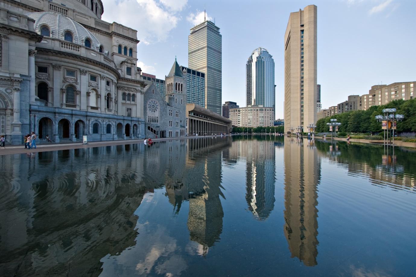
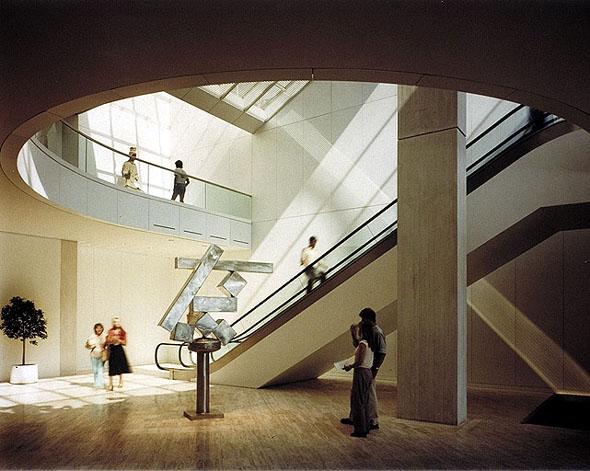
Firstly, it is worth mentioning that even though both projects incorporate natural elements, the effects they produce are very different. While water used in the design of the Christian Science Center extension creates reflection and adds symmetry to the complex structure of the buildings around (see Image 1), the light employed in the design of the West Wing produces a completely opposite effect bring in asymmetric elements and complicating the visual attributes of the space (see Image 4).
In terms of circulation, while the West Wing has just one entrance, the Christian Science Center extension has three different ways one could enter its territory, that is why the circulation is better in this project. However, both of them are surrounded by a large open space with trees, so they can host many people at a time without facing a problem. As for the organization of the spaces, the Center has more thought-through planning, while the West Wing’s open space is more natural. The aerial views of both projects reveal that they are shaped differently as well – the Wing is rectangular, and the Center is comprised of triangular shapes.
Conclusion
To sum up, the two architectural projects under analysis have impressive designs. They were created by the same architect, but they have different purposes and structures. The style of the architect is recognizable in the well-balanced incorporation of natural elements such as light and water into the building designs. This technique was meant to enhance the beauty of the buildings and add some visual complexity to their structures and appearances. Both projects include multiple straight lines and repetitive geometrical patterns which create quite a modernistic impression with the combination of simplicity of minimalism. All in all, the projects produce memorable impressions on the visitors due to the outstanding talent of the architect I. M. Pei.


Works Cited
Boston Landmarks Commission. Christian Science Center Complex. 2011. Web.
MFA. Architectural History. 2016. Web.
