Summary
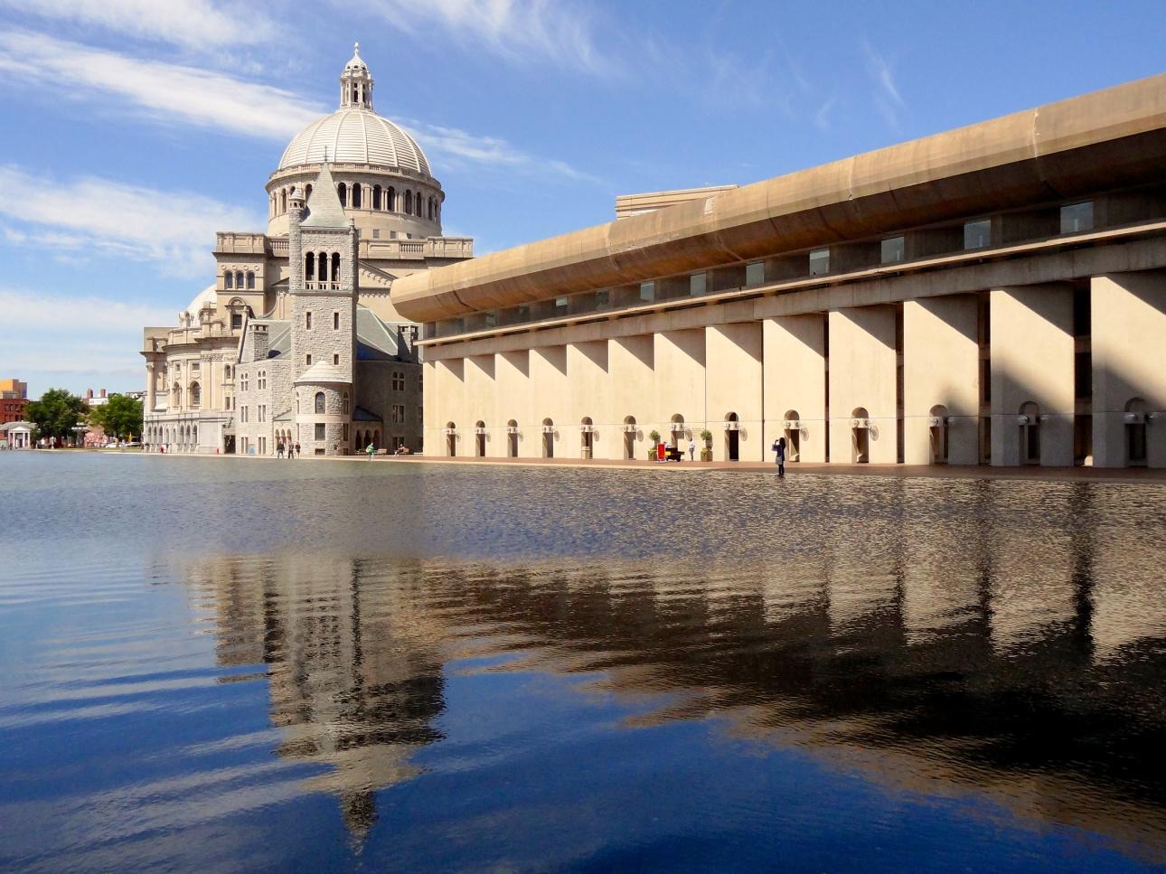
The two structures, an extension of the Christian Science Center and the West Wing addition to the Museum of Fine Arts designed by I.M. Pei & Associates display a fusion of traditional marble-brick design and modern steel-glass. The structures are towering, spacious, and unique in the interior and exterior physique. This analytical paper attempts to explicitly analyze the similarities and differences between the extension of the Christian Science Center and West Wing’s addition to the Museum of Fine Arts structures in Boston. Specifically, the analysis is based on factors such as program, site, plan, structure, materials, enclosure, entrance, organization of space/functions, and circulation. In addition, the paper will present personal opinions on the best structure.
Brief Description of the Structures
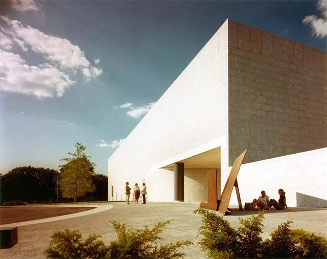
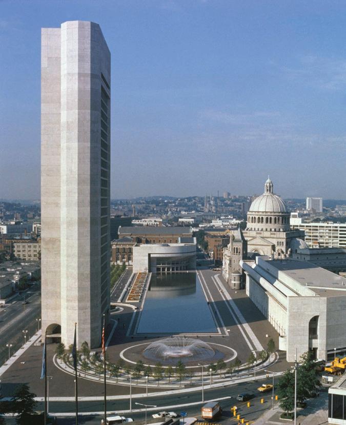
The extension of the Christian Science Center structure was completed in the year 1973 and was designed by I.M. Pei & Associates. The structure is located in Huntington Avenue and comprises five components including a pool and a Sunday school building. This structure is an extension of the original Mother Church building, which was constructed in the year 1894. On the other hand, also known as the Linde Family Wing for Contemporary Art, the West Wing structure is an addition to the Museum of Fine Arts. The West Wing was also designed by I.M. Pei & Associates and was completed in the year 1981.
Comparative analysis
Program
The two structures share the same program in design and structural orientations since they were created by the architect. The program is characterized by a fusion of old and modern architectural design as an extension of previously existing buildings. The program design is very successful since the fusion is consistent in the two structures (Huxtable par. 9).
Site
The extension of the Christian Science Center covers more space than the West Wing addition to the Museum of Fine Arts. Specifically, the extension of the Christian Science Center has three structures integrated into a single wing. On the other hand, the West Wing covers less than 10 percent of the original Museum of Fine Arts structure. The site for the extension of the Christian Science Center is more appealing, especially with the addition of a reflecting pool and 26 stories structure as attached in appendix 2. To complete the artistic view, the two structures have similar public space designs. However, the space allocated to the public is larger in the West Wing structure than in the extension of the Christian Science Center as attached in appendix 1 (Kevin 45).
Plan
The plan for the two buildings is simple and adopts the traditional styling, in terms of their willful arbitrariness. The two structures are both symmetrical to serve prescribed functions. The plans of the two structures assume the sculptural form, despite a small contrast in their synthesis versus styling. For instance, the west wing of the Art Center is a product of an “essentially sequential process of design development” (Huxtable par. 15). On the other hand, the structures within the extension of the Christian Center assume the form of an “an integrated simultaneity of the process with all disciplines working closely together and all forms the product of everyone’s input” (Ivey 33).
Structure
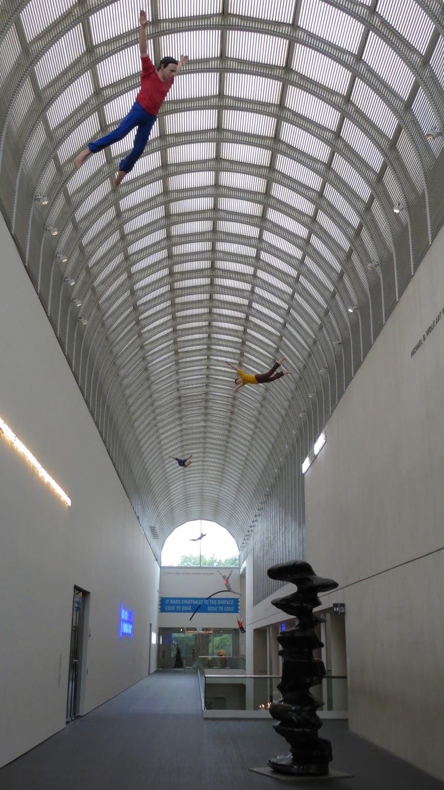
The West Wing addition to the Museum of Fine Arts structure is three stories tall and has a circulation spine interchanging big pillars and flowing walls. The walls are a “combination of lacquered white panels on one side and smoothly crafted concrete on the other” (Ivey 47). The structure is characterized by suaveness in finishing characterized by merging long and narrow passages as attached in appendix 3. There is a flowing match of old and new columns in the structure through the inclusion of an aluminum frame on the edge of the vaulted roof made of glass. The same strategy is adopted in the extension of the Christian Science Center with minimal variation in the overreliance on granite and marble to complete the touring pillars at the base of the structures as attached in appendix 4.
Materials
The extension of the Christian Science Center is dominated by granite material and the fusion of bricks in the upper part to create an appealing concave appearance. These are large glass windows conspicuously placed on the eastern and western walls to create the effect of free-flowing space and well-lit space. The floor is made of marbles and a mixture of wooden carving, especially near the western wall from within. The marbles are of different designs, colors, and shapes (Kevin 28). The granite material is concentrated on the wall frame and is artistically curved to create a magnificent and royal appearance. There are concrete and steel frames in the roof and wall corners. The steel frames are cleverly mixed with wooden frames to create a perfect fusion between traditional and modern structures. On the other hand, the materials used in the West Wing addition to the Museum of Fine Arts are glass, steel, marble, and granite. On one side of the wall, the white panels of granite dominate the frame while large glass panels dominate the other wall as attached in appendix 5. The roofing is made of symmetric glass panels, and an aluminum frame (Huxtable par. 12).
Enclosure
The old and new sections joining the left-wing are merged without any jarring transitions and there is excessive daylight penetration in all corners. The enclosure appearance is pristine, retrained, and warm with the inclusion of the board-marked concrete surfaces. In the extension of the Christian Science Center, the barrel vault roofing position reveals a perfectly horizontal enclosure that is flashy and flat on the surface (Huxtable par. 7). This arrangement auger well with the Maine granite since it is unrevealing and bland. The enclosure of the extension of the Christian Science Center is larger than that of the West Wing addition to the Museum of Fine Arts as attached in appendix 4.
Entrances
The new facade is the main entrance to the West Wing addition to the Museum of Fine Arts. The facade is adjusted to an expansive parking lot. The entrance is characterized by large concrete columns, cornices, stairs, and perfectly placed moldings. Besides, the entrance has a series of conventions and paraphernalia of Beaux-Arts to create an automatic feeling of contrast and proportion. The entrance can be described as taking the form of classical freebie style as attached in appendix 3 (Huxtable par. 12).
In the extension of the Christian Science Center structure, there are large pillars in the facade that give way to “stairs and ramps onto platforms and balconies glimpsed through arches and balustrades” (Ivey 28). The entrances are larger than the west wing structure. The entrance to the extension of the Christian Science Center structure is artistic considering the perfect balancing of marbles and concrete in the extensive and symmetric pillars. The pillars create an illusion of unending space that opens to a spacious interior as attached in appendix 6.
Organization of space and functions
Upon entering the West Wing addition to the Museum of Fine Arts, the first sight is open space dotted with smaller rooms at the extreme end. The raised roofing and large windows give the illusion of a continuous space that is well aired and lit. The West Wing addition to the Museum of Fine Arts can be described as the epitome of delight, elegance, and dignity (Huxtable par. 17). The wing is very beautiful and covers approximately 225 feet. The structure is characterized by the white space enclosed in a towing glass barrel that is approximately 52 feet. From an architectural perspective, the illusion fits in the galleria structure. The spaces are reserved for small shops, open public space, and a wide art library.
In the extension of the Christian Science Center structure, each component has its unique organizational space and functions. The Sunday school building is a single unit that opens to a wide space dotted with wooden seats and offices in each corner. The Colonnade building and the reflecting pool are artistic units that are defined by perfect geometry to create the perception of space and conservative architecture. The open public space is dotted with marble seats and small tables (Walsh par. 12). This completes the artistic design of the building.
Circulation
The two structures have very large spaces in the interior and exterior. The inclusion of large windows and long corridors creates the illusion of flowing space. Besides, the extensive walls and towering roofing in the two structures have created better circulation from below and above each floor.
Works Cited
Huxtable, Louise. Architecture View; Pei’s Elegant Addition to Boston’s Arts Museum. 1981. Web.
Ivey, Paul. Prayers in Stone: Christian Science Architecture in the United States. Urbana, Illinois: University of Illinois Press, 1999. Print.
Kevin, Matthews. The Great Buildings Collection. New York, NY: Artifice, 2009. Print.
Walsh, Colleen. The Art of Architecture. 2011. Web.
Appendices
Appendix 1
Appendix 2
Appendix 3
Appendix 4
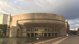
Appendix 5
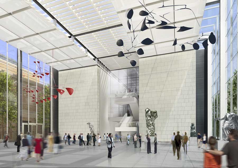
Appendix 6
