Introduction
The branding/advertising world portrays a rather competitive environment among businesses and, therefore, customers’ perspective about a brand is vital. As such, perspective greatly influences the purchase and loyalty to a certain brand. A positive perspective will tend to attract more customers while a negative perspective will make a customer shy away from a brand. It is clear, therefore, that changing or improving the customers’ perspective is a prerequisite to any company intending to augment its sales.
Changing brand perception, nonetheless, is somewhat a challenging process, which can be expensive. Additionally, in an attempt to change customers’ perspective, a firm should be dedicated, determined, and committed to the process. The company has to employ effective and appropriate techniques and tools, which could include basic ones like logos.
This paper, therefore, evaluates the effectiveness of logos as a tool to change the perspective of a brand. Notably, the use of logos is a vital aspect of the market branding/advertising strategies since logos are the basic representative of products and services, which differentiates a brand from competitors’ products.
Background information and history of logos
Definition of logos
A logo is a recognisable graphic design element, which oftentimes includes a name, symbol, or trademark representing an organisation or a brand. Logo designs are noticeable features of communication and are used in packaging, employees’ uniforms, letterheads, business cards and other sales and promotional tools (Kim et al. 2013).
Generally, logos are designed in four basic forms, which include the use of texts, illustrations, symbols, and the combination of more than one of these three.
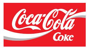
Textual logos use styled renditions of brand names such as Coca-Cola. The text, however, is always written in distinctive, fonts, sizes, and outlines.
Illustrated logos are artworks using colours and shapes to represent a brand. For instance, the Pepsi-Cola brand uses white and blue circles.
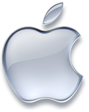
Symbolic logos use symbols to represent a brand. For example, Apple uses an apple. It is imperative to note that symbolic logos tend to work well internationally, especially due to their ability to communicate to people from different languages.
Some companies use the mixture of more than one of these techniques to design their logos. For instance, FedEx uses both text and a symbol (Lorette 2016).
It is imperative to note that logos can be used to serve more than one purpose in influencing the brand perspective. Mostly, logos create visual symbols that represent a brand.
The concepts of branding and change of perspective
A brand can be defined as a name or term, which differentiates a product from one specific seller to another (Maurya & Mishra 2012). For instance, there are a myriad of beverage products from different manufacturers. However, a customer can distinguish between Coca-Cola products and other beverage products due to their unique names and qualities. The name Coca-Cola and the unique characteristic associated with Coca-Cola make the beverage a brand. Branding, on the other hand, comprises of activities geared to embed a brand in customers’ mind through various marketing approaches and methods.
Many companies’ goals are to ensure that their products gain a robust foothold in the market and have as many loyal customers as possible. Companies sell their products based on their brands and, therefore, customer perspective on a brand is vital.
Change in perspective involves positive and negative changes. A negative change in the brand perspective will imply that customers will shy away from purchasing the products while a positive change implies that the brand attracts more customers.
Since logos are the visual representation of a brand, they highly influence customers’ perspective on the brand. A strategy for a change in perception will initially include a clear picture of the brand perception. The need to change the perspective will be realised by analysing the actual public perception then comparing it with the ideal or the desired public perception.
Customers form opinions and perceptions based on what they see and, therefore, brand logos highly influence customers’ perception of a brand.
History and the evolution of logos
Logo history dates back to the ancient civilisation when people used images to portray information in the form of pictures and diagrams. The pictures and diagrams were used in place of words and ideas.
For instance, the Ancient Egyptians used hieroglyphs on their domesticated animals as a sign of ownership. Romans and Greeks in the ancient world used logos in forms of uniquely designed marks on their artworks to recognise the manufacturer. Religions are also among the ancient groups known for the use of logos for ease recognition of specific faith. The 12th century saw the use of heraldic designs to represent status, dignity, and leadership.
Specifically, the 13th century saw the beginning of more elaborate use of logos. During this period, goldsmiths initiated the use of watermarks by paper with the rising of trademarks.
Most of the modern logos, however, find their roots in the 19th century. For instance, the Rock of Gibraltar was initiated in 1896.
In the beginning of the 20th century, there was a milestone in the design world when the colour print was introduced. The 20th century also saw the birth of the advertising industry and companies adopted the use of logos to represent their brands. There was also an augmented understanding of many logos by customers and the public in general.
However, logos in the advertising world in the beginning 20th century did not integrate the concept of targeted advertising. Therefore, logo designers used descriptions and images with fewer limitations.
For instance, cigarette companies used logos that made the public have a positive perception of their products. It is imperative to note that the health issues associated with cigarettes products was then a non-issue, and therefore, the logo limitations on cigarettes products were minimal.
The end of the 20th century and the beginning of the 21st century saw drastic changes in the advertising world.
The current advertising/branding is extremely complicated and myriads of products are trying to appeal to the public. Conversely, designers are looking for ways to make logos as simple as possible. With a simpler logo, a brand is recognised easily and fast and, therefore, the brand will be more appealing to customers and the targeted audience in general.
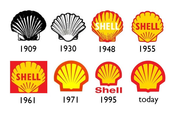
A good example of a brand logo that has evolved to embrace simplicity is the Shell Logo.
Purposes of logos
A corporate logo is expected to be a visual representation of a company, a product, or a brand in general. Logos exhibit the unique identity of a brand and are intended to evoke a psychological reaction in the targeted audience. Logo designers use specific colours, font, and images to deliver vital information about a brand and, therefore, allow the intended audience to identify with the core brand.
Additionally, logos are used by corporates to advertise their brands. With the shorthand and simple outlooks, logos make it easy for brands to penetrate an extremely competitive market (Gillikin 2016).
Furthermore, logos are intended to engage the targeted audience and evoke emotional responses. As such, the customers’ perspective of a brand should be influenced by the emotions the logo creates. Logo designers have devised a number of ways to ensure that the customer is engaged and feels as a part of a brand, for example, the use of logos with hidden meaning (Andrew 2012).
A company’s branding exercises are not only initiated by the brand logo, but are also dictated by the logo. Logos appear on all advertising and sales tools and, therefore, logo designs influence designs of most advertising and branding tools of a company. For a positive influence, a company should design a professional-looking logo.
Shapes, sizes, and topography
Research has revealed that aspects like shape, size, and topography of a logo design have enough power to influence a brand perception (Jiang et al. 2015). Therefore, the circularity and angularity of a brand logo go beyond shaping and portraying the attributes of a brand.
It has been conjectured that circular logos invoke a perception of softness while angular logos initiate hardness relationship with the represented brands (Sneed 2016). As such, the circularity or the angularity of a logo design affects the perceived brand characteristics.
Logos are part of the larger marketing context and, therefore, their shapes will not comprehensively influence customers thoughts on their own. Thus, shapes and sizes are some of the many aspects that influence customers’ perception, and they are vital for the design (Sneed 2016).
Colours
Different colours have different psychological impacts on the viewer’s perspective. Therefore, selecting colours is a vital aspect of the process of designing a logo. The colour selection process should consider the effect of the colour effects on human emotions.
Companies have adopted specific colours for their logos based on the intended psychological impact of the brand on customers (Ridgway & Myers 2014). Further, customers use the adopted colour in the logo design to interpret service and products offered by companies.
Green logos
Majorly, companies use the green colour to portray how committed they are to environmental conservation. The green logos give a perception that a brand is environmentally friendly and poses little or no threat to biological species. Thus, green logos act as both social responsibility techniques and giving a perception of how a brand is (Ridgway & Myers 2014).
Additionally, companies like Heineken that intend to give a perception of a tough, sustainable, and masculine brand use green logos.
Purple and pink logos
Companies use purple and pink logos in an attempt to portray trendy and fashionable brands. Particularly, purple logos portray a brand that is feminine, glamorous, and charming. On the other hand, pink logos invoke the perception of youthfulness, imagination, and fashion in brands.
Yellow logos
Companies that use yellow logos tend to bring out the perception of fun and modern brands.
Red logos
Logos with red colours give a brand the feeling of expertise and self-assurance.
Blue logos
The blue colour makes consumer perceive a brand to be full of confidence and likely to priorities success and reliability.
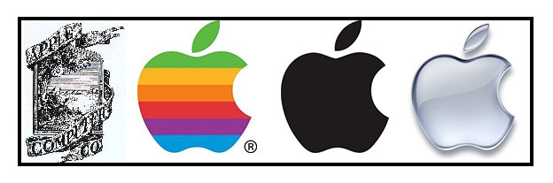
Notably, changes in the colour of the same brand may invoke a perception of improvement or solidification of a brand. For instance, the Apple brand has evolved throughout its history changing the logo. The original Apple logo was cultured and relatively not appealing. However, the colour of the logo has evolved to the current one that evokes the perception of the powerhouse technology company (Ridgway & Myers 2014).
Decisively, the choice of the colour highly influences the customers’ perspective on the brand. The colour is the most commonly remembered visual component of a logo. Precisely, a proper choice of appropriate a colour of the logo can enhance the brand recognition by more than 80%. An appropriate colour will incorporate aspects such as temperament and personality of a brand (Ridgway & Myers 2014).
Complex or simple logos
The current branding/advertising world is full of myriads of logos and, therefore, it is somewhat complicated. Additionally, people are not willing to spend too much time on logos and advertisement. Therefore, a logo should be as simple as possible. However, studies have revealed that simple logos have short-term benefits while long-term benefits are attributed to complex logos (van Grinsven & Das 2014).
Memorable logos
Memorable logos are linked to positive brand benefits and enhanced products perception (Siegel & Gale 2015). Therefore, powerful brands use logos that have symbols connected to customers’ memory. For instance, the Apple symbol does not need to be used with the text “Apple” for the intended customer to recognise the represented brand. Therefore, for enhanced impact on a brand, a logo should be easily remembered and quickly associated with the brand it represents.
For a logo to be memorable and influential on customer perception, it has to be simple and comprehensively deliver brand benefits. Research has shown that customers are more likely to bestow positive attributes to conversant and memorable logos and consequently perceive familiar brands as reliable and trustworthy (Birkner 2015).
Consistent and regular use of a logo will enhance the remembrance of a logo and the brand it represents (van Grinsven & Das 2014). The logo should also express the core characteristic of a brand. Further, the memory imparted by logos can be evaluated using feedback from, surveys, piloting exercises or from trusted outside perspective.
Hidden Meaning in Logos
Concealed meaning in a logo characterises the magic of design. Outstanding designs should not only making logos look pretty but also create meaning and affections, and therefore, connect with customers or the intended audience.
Meanings in logos are oftentimes not easily derived, as they are not always apparent. However, once the intended customers comprehend the meaning, they feel special since they can now “get it” and, therefore, feel like a part of the brand. For instance, the Toyota logo has a concealed meaning, which cannot be perceived by a simple glance. The Toyota logo is made up of three interlocking ellipses. A customer will feel special once they understand the meaning behind the ellipses. Actually, the ellipses signify three hearts, which are customer’s heart, the brand’s heart and the heart representing the advancement in the industrial field. The logo, therefore, contains an emotional meaning that can enhance the perception of the Toyota brand. Other iconic logos whose meaning is not direct include the McDonald’s, Apple, and Pepsi among others (Johnson 2011).
What makes a logo Iconic?
The current branding/advertising world is highly competitive and, therefore, myriads of logos (representing numerous brands) are all over. As a result, for a brand to be outstanding and be visible it has to be represented by an iconic logo. The ultimate goal of logo designers, therefore, should be to ensure that a quick glance at a logo would leave a lasting and a positive effect in the customer’s mind (Airey 2016).
For a logo to be effective and invoke a positive perception, it is has to have a number of characteristics.
First, logo should be pertinent and appropriate for the brand it represents. For instance, a fun design that makes everyone smile may not be pertinent to a crematorium and, therefore, inappropriateness may render it not iconic (Laughton 2014).
Second, logo designers should incorporate traditions of a certain brand in making of iconic logos. Investing time and resources on a short-lived logo that does not incorporate the roots and traditions of a company could be disastrous.
Third, a logo should be as adaptable as possible. Therefore, a designer should make a logo that works across a diversity of mediums and applications. For instance, an effective logo should be designed in a vector format to ensure that it is as versatile as possible (Kern n.d.).
Fourth, for a logo to be iconic, it should be distinctive and unique to enhance recognition (Laughton 2014). Amid many logos representing competing brands in the marketplace, simple aspects such as shapes or outlines of a certain logo should make it outstandingly visible and recognisable.
Fifth, logo designer should commit to memory for their logos to be exceptional. A quick glance at a logo should have a relatively strong impact on the customer’s mind in such a way that the customer will remember the brand instantly the next time they see the logo (Laughton 2014). Most powerful brands use interesting texts embedded with attractive fonts or eye-catching symbols to enhance memory.
Six, a logo design should be a simple as possible. Most of the iconic logos use simple symbols with as few words as possible (Laughton 2014). The use of simple pallet of at most three colours and photographic content has become somewhat popular with most powerful brands. However, the logo must be comprehensive to represent all the intended aspects of a brand.
Lastly, the intended message should clearly come out at a quick glance. The customer, therefore, should not take a lot of time pondering to derive meaning out of a logo.
Global iconic logos that positively influence customers’ perspective
Some of the globally recognisable brands include FedEx, Nike, Coca-Cola, Shell, Apple, and Pepsi among others.
Modernisation and Simplification of Logos
A company logo is considered among the most vital sales and promotional materials. Logos ensure that organisations have bold impacts on the target markets. Hence, a great logo is fundamental in branding.
Although businesses may undergo rebranding, which, to some extent, could be an intimidating. Rebranding is however a critical part of business development processes. Several companies consider rebranding as an opportunity to communicate their growth, new attitude, and approach to business, as well as new identity that accompanies these achievements. In this instance, a logo is usually affected.
Many multinational firms, for instance, have changed their logos over time, but notably in the year 2014. Logo redesign moved from 3D to 2D. Netflix and Olive Garden redesigned their logos to meet these new specifications as a part of logo modernisation and simplification (Tod 2015).
It is observed that rebranding of a company is an extremely complicated process that needs execution of detailed work. It requires the company to determine the exact need for renewing the design and executing the changes to the brand in all aspects of marketing, including the Web site. As such, organisations attain new brand identities because of rigorous efforts (Goh et al. 2013).
Organisations may perform rebranding for a number of reasons. First, changes in attitudes of the target consumers may result in rebranding. Rebranding may be initiated to counter the stronger, emerging competitors that consume a company’s market share. Finally, rebranding may be introduced to create change and introduce new goals for the company. Rebranding ensures that a brand emerges as a totally different item simply by transforming the logo, the name and even company colours.
For products, services or brands, rebranding represents an extremely delicate activity. It must create the new brand into the minds of the target audience or fail. Rebranding must revamp the brand identity and eliminate all its weaknesses. At the same time, it must further reinforce stronger aspects of the brand. Vodafone, Starbucks, and Airbnb among other global brands have undergone through the process of rebranding and modernisation and simplification of the logo is particularly noteworthy.
Companies such as Nike, Starbucks, and Shell have rebranded by removing their names of their logos. This trend is becoming popular among multinational elite firms. For small businesses, elimination of a company’s name from a logo may not make branding sense. However, logo redesign is always a strategic move for larger organisations (Graves 2016).
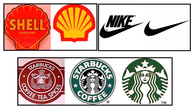
It is imperative to recognise that logo redesign often borrow heavily from the previous logos. For instance, Starbucks has consistently maintained its well-recognised themes, colours and image. Obviously, one would note that the previous logos and the new versions often represent the same brand and company. The most important change in these redesigned logos is the obvious lack of the company’s name, which declares an intended goal for the brand. That is, iconic status in the market. The company has adopted the radical redesign in order to be counted among the elite groups of firms that are merely recognised from their images (logos) without a name. Thus, logo modernisation and simplification often has clear goals. In this instance, Starbucks understands what the company would get in return. As such, any attempts to modernise and simplify a logo should always aim for a specific purpose. For instance, firms evaluate whether the new design would enhance their competitive edge or increase their sales. Alternative, companies aim to demonstrate new practices, new brands or reinvent their looks. Thus, executives should always have a clear aim when improving their logos.
Logo designers have often claimed that a multipart logo design has often sent wrong messages, mixed messages, or generally many much complicated information to the target audience. The first Apple’s logo of 1967 was an example of such a logo. While the logo reflected the story Newton and the falling Apple, it was never punchy as the consumer market became highly competitive and crowded. The company decided to redesign a new logo filled with rainbow colours in 1977. In fact, the redesign processes have ensured that Apple has become the most recognised brand globally. In 1998, the company replaced its logo with a black, which has since been replaced with a new unicolour logo that is found on all Apple products.
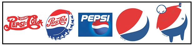
It is therefore imperative for organisation to assess how the new, improved logo would better deliver the core intended message. The logo could be murky and noisy. In this case, a company should consider a redesign while retaining the most vital elements without damaging the original brand. That is, it is possible to eliminate incomprehensible noisy logos through simplification without hurting the brand. Alternatively, an entirely new logo design may be used to reach the target market. Ideally, organisations want to communicate clearly to their target consumers based on their identity, what they do, offer but without affecting existing customers negatively. In attempts to gain competitive edge from redesigned logos, for instance, to eliminate the noise, or attain iconic status, some organisations often go beyond the expected. For instance, Pepsi initiated an effort to topple Coca-Cola as its key rival. It introduced a new logo without a name in 2009, but with a wide abstract smile. Soon after Pepsi launched its new logo, many critics – mainly expert designers focused on the interpretation of the smile in a manner that embarrassed the company. While the effect of critics’ ridicule of the logo and subsequent negative media portrayal were difficult to ascertain, the company’s redesigned logo with its million-dollar investment in rebranding campaign did not give Pepsi the desire outcome of overtaking Coca-Cola. In fact, Pepsi is yet to beat Coca-Cola on brand reputation. In this case, companies can learn a simple, basic lesson. It is necessary to get inputs from everyone during logo design and rebranding. Supporters alone may not give the realistic view on the logo. Companies should get opinions of everyone, including people not so familiar with the brand. They are most likely to assess the logo in terms of service, values, customer and the company story and perhaps identify other elements beyond what the company can see. Hence, new suggestions can be used to improve the logo design and rebranding processes.
The case of Microsoft Windows 1983 launch led critics to ask what the issue was. The logo had a faint blue rectangular shape with round corners to represent the Window. The company introduced new logos with intense colour showing an idea of movement represented on a flag-like shape. Windows 8 has now introduced a new logo for the company. However, critics were still focused on the new logo and the flag-like shape. The company is known for Windows and, therefore, it had no purpose for incorporating a flag in the logo design. According to Microsoft, the logo was originally meant to be a window. The company believes that ‘Windows’ is the perfect metaphor for computing, and the new logo was meant reinforce the idea of a window put in the perspective of computing. It is noted that Microsoft took almost 30 years to realise that the initial design was the best representation of ‘Windows’. Thus, the lesson is simple – companies should not struggle to fix a perfect logo that lacks noisy and is not murky. That is, if the target consumers clearly and genuinely recognise the current logo, and the logo relays the intended message, then it is not important to change during modernisation and simplification processes. Microsoft had attained significant recognition from the colourful Widows flag because of constant repetition. Nevertheless, the original logo of the company was simple but an actual reflection of the company’s brand. It is therefore important to assess the aim of branding. For instance, if the major goal of a company is to modernise an old logo, then it is important to redesign minor elements while introducing minor changes to the design (Zhang 2015). Today, Windows 8 shows square boxes, which ultimately reflects the company’s overall design. In addition, Microsoft has more freedom to include the design in other sub-brands such as the new Office 2013. This approach ensures that Microsoft has overall consistent on its brand identity globally (Zhang 2015).

Logos are good for brand visual identity (Airey 2009). Redesigns, however, require perfection execution, simply processes alongside controlled diversification. A simple logo ensures that a company can attain a significant level of versatility when using them. It is imperative to recognise that brands that often go for logo redesign already have high brand visibility and awareness. The target audience is familiar with such brands such as Microsoft, Starbucks, and Netflix among others. Hence, they can aim for iconic status without curtailing brand recognition. Conversely, small businesses often go for more literal logo redesigns to enhance their visibility and recognition.
In the current crowded consumer marketplace, firms should focus on more than the logo when rebranding. Instead, the ultimate goal should focus on the overall impact of the logo on the brand and the target consumers.
Businesses understand complexities and risks that are associated with rebranding. In fact, they strive to avoid mordernisation and simplification failures. Everton Football Club, for instance, eliminated its crest in the newly redesigned logo. Many critics and fans concurred that it was the most sensible thing to do (Hardy 2013). The major reason for modernising and simplifying the logo was to simplify the design and ensure that it could be easily used across various mediums. The previous logo could not meet that requirement.
Auckland Institute of Studies focused on changing colours in which gold was replaced with orange because of the observed reproduction challenges while aiding in modernising the scheme of colour (Jigsaw Design 2012). At the same time, the company introduced more words – New Zealand- to help in recognising the brand the global marketplace (Jigsaw Design 2012).
Overall, in the modernisation and simplification processes of new logos, companies should ensure that the resultant logo is simple, memorable, timeless, versatile, and appropriate (Cass 2009). A simple is preferred because of ease of recognition. At the same time, it creates memorable, versatile logos. A good logo should unique while avoiding all elements that contribute to fussy logos. In this regard, simple design principles are incorporated to achieve ease of recognition while conveying the intended brand image. A modernised simple design is therefore most likely to catch attention of the target audience irrespective of the media used. For instance, the simple ‘swoosh’ of Nike is easily recognised globally.
Logo memorability is also an important consideration for modernisation and simplification. Simplicity also contributes to logo memorability. McDonald’s is recognised for a simple, memorable logo. It is argued that the subject matter of a logo could be little relevance while the appropriateness may have no fundamental role at all (Cass 2009). That is, appropriateness is vital. However, it is always difficult to relate a logo and identify one-to-one connection between the symbol and its meaning. It is often difficult to achieve direct connection, particularly objectively. Ultimately, modernised logos should be clear, distinctive, and memorable (Cass 2009). Logos should also be timeless as reflected in the case of Coca-Cola. The company’s logo has endured ages with no alteration even after several decades as opposed to Pepsi Cola. Logos should not be associated with the industry trends because trends are often restricted to time limits. Brand identity should be guided by longevity concept while helping the company to stand out from the rest. Coca-Cola shows how timeless logo is effective across various ages and even in shifting demographic characteristics. Finally, logos should be versatile to ensure that it can work across a wide range of platforms and applications. Modern logos should be functional, and should incorporate vector format design. This design allows scalability to fit the preferred size.
Changing the Logo – A Good or Bad Idea?
The most important issue is what element constitute a good logo. According to Cass (2009), “a good logo is distinctive, appropriate, practical, graphic, simple in form and conveys an intended message” (p. 1). A logo’s visual features can make or destroy a brand. For little known companies, the logo is the most important feature for conveying values while striving for customer loyalty. In most instances, a logo is associated with a product or a service. McDonald’s golden arch may represent the big macs while the BMW logo may be associated with high-end cars (Cohn & Bromell 2013). Above this, though, logos could also trigger various feelings in customers as they strive to represent companies and their ideals.
Consumers may get bored with certain logos. In addition, consumers, as humans, oftentimes want novelty, which pushes companies to rebrand and introduce new looks. In this process, logos are often subjected to modernisation. However, organisations should always ask themselves whether a logo redesign is necessary.
Experts however warn that companies that consider redesigning their logo should tread carefully (Kalb 2011). The cases of Starbucks and Uber reflect possible consumer resistance to a change in logo designs. The criticism has become intense in the age of social media where reactions are instant. When Starbucks changed its logo, critics did not spare when the company’s name and the ‘coffee’ were removed from the new design while the mermaid portrait was increased in size. The subsequent reactions were fast and fierce. One critic, for instance, wrote that, “Who’s the bonehead in your marketing department that removed the world-famous name of Starbucks Coffee from your new logo? This gold card user isn’t impressed!” (Kalb 2011, p. 1). Previously, GAP had expressed its desire to change the company logo. However, the company faced intense ire from customers. Consequently, GAP was forced to retain its old known logo.
Uber is another case in point. Recently, the company changed its logo to reflect its changing business model, which has gone beyond the taxi-hailing app. Many customers were, however, not pleased because the app is simply confusing (McCauley 2016). As opposed to the monochrome U-shaped logo design, which has gained its place in the minds of several customers globally, Uber’s new logo has no direct links with the company’s name. It is a colourfully decorated symbol with a symmetrical shape located in the centre to represent the driver and a rider with a small squared shaped part (McCauley 2016). Several customers expressed their disappointment. For instance, some claimed that they did not like the new logo at all because the original logo was super clean while the new design had swirly edges. Others noted that they could not even tell if it was the company’s logo while others asserted that the logo belonged to a bank. Uber executive, however, maintained that the new logo captured the company’s growing mission of moving food, goods, and perhaps more than expected.
Conversely, Facebook new logo did not draw much criticism perhaps because of its intended purpose (Chew 2015). While the new logo retained the company’s name, there were conspicuous changes on the letters, the size, and the white colour around them. The company wanted to modernise the logo and make it user friendly and approachable, specifically for smartphone users (Chew 2015). The company asserted that the design was a major change, and it was a mobile-driven logo.
Several firms fail to understand explicitly the relevance of a logo, and its connection between the customer and the brand. Logo is a symbol that resonates with customers who want to feel comfortable about the company and their products. From scientific perspective, it has been established that the brain can resort to short cuts during information processing (Kalb 2011). Hence, there is limited anxiety and quick decision-making when the brain can recognise symbols faster and remain comfortable with them as the preferred logo of a given brand. Any changes to the logo therefore interfere with the comfort zone of the brain. This explains why majorities of loyal customers react angrily when organisations make changes to their logos. Data have shown that consumers relate logos with aesthetics (Machado et al. 2012). Conversely, a company’s name is linked to the brand and brand presence in the market. Executives should collect feedback from consumers prior to redesigning a logo.
Thus, before organisations invest millions of dollars and rebranding, they must evaluate fundamental factors that concern the logo.
When to change the logo
Organisations should not redesign their logo just for aesthetics and for a new face of the company. Logo changes should be aligned with significant changes in the company, including new products, services or when the company has transformed its business practices, values, position, and principles. Companies that have become major players in the industry want to target younger consumer segment or feel that the market conditions have shifted significantly may consider logo redesign. As such, they may opt for a stronger logo, appeal to younger demographics, and meet changes in consumer behaviours. While these fundamental factors should guide logo redesign and subsequent rebranding, it is imperative to consider other factors too.
First, organisations should considered changing their logos when their image is ruined. A damaged image should be fixed through rebranding. For instance, an aircraft company, such as the Florida Everglades, changed its logo and name after the crash. It was sensible to change the name and the logo because the crash had terribly ruined the image of the company and subsequently affected customer perception. However, one may wonder whether BP or Malaysian Airlines should also change their names and logos after the Gulf oil spill, and plane disappearance and accident respectively.
Second, a company should consider altering its logo when it has changed significantly. Logos are designed to reflect what the business does. However, when there is a change in direction, then logos too should be changed. Uber, for instance, started as taxi-hailing app. However, today, the company claims that it has expanded its business to include moving goods and food, and so will increase the number of services. While the change of logo was necessary, many loyal customers are not pleased with Uber’s new logo that resembles a bank logo. Nokia is considered as company that has changed its logo to reflect changes in the business. Thus, changes in the logo should be driven by the evolving business.
Third, logos should be redesigned when they present reproducibility issues. Apple, for instance, had a multi-coloured logo that was not simple to copy. Besides, the company target audience changed in the 1970s and 1980s. Today, however, Apple had to redesign its logo to reflect changes in the target market and enhance reproducibility.
Finally, social media are now widely used particularly by the younger demographics and on smart portable devices. It is generally noted that new executives may want to change the logo, revamp their brands or solve the problems of the relationship between the logo and its products. Starbucks changed its logo without any known reasons, but it could have been to join to the elite groups of companies. It is noted that Starbucks, just like Uber, did not consult their loyal customers. Uber decided to produce the logo using in-house designers. However, in the period of social media, it is imperative for firms to gather data from their customers on possible logo change in a manner Everton FC did. GAP, Uber, and Starbucks have risked eroding the strong relationships with their loyal customers because they did not consult them. The social media have created a publicity challenges for poorly designed logos. The case of RJ Metrics reflects a publicity challenge associated with the logo change even though they received feedback from few individuals. Nevertheless, the company was asked to explain why its logo was like “a giant pair of orange Y-Fronts” and whether it was intentional (Moore 2013). Y-Fronts refer to underpants, particularly in Britain where most individuals sampled saw the logo as underpants. The company at least listened and changed the logo.

Logos should define the brand and the company. Companies are encouraged to research and redesign logos that reflect their missions. Logos should help consumers to relate with the company and reflect the company’s culture to help in developing a successful brand. Getting the right logo to meet these standards is cumbersome and reflects how executives want their companies to be portrayed to the target audience.
A simple logo redesign may be sufficient to appeal to the target demographics and introduce a new concept. Simple modifications should be considered for colour to modernise the logo while enhancing the competitive edge.
Logo modernisations and simplification should also be considered when a new tagline is necessary. A tagline can either be added to define what the business does or removed to simplify a logo image.
Facebook, for instance, had to change its logo because of smartphones. In this regard, it was mandatory for the company to redesign the logo to ensure that it was suitable for various mediums for smartphones and social media.
As previously mentioned, logo change is a part of rebranding, and it done to in cases of merger, meet dynamics in the market, revamp the company’s image, clarify a value position, or inform customers about the new position of the company in the market (Peterson et al. 2015). Research however has demonstrated that brand managers should understand both positive and negative implications associated with the logo redesign (Peterson et al. 2015). Specifically, consumers are most affected by such changes. Accordingly, firms should anticipate such reactions prior to logo change.
Listen to customers
Starbucks and Uber are two companies that failed to listen to their customers when they were rebranding and changing the logo. Consequently, they got unexpected feedback from angry loyal customers. Conversely, Gap had to listen to its customers when it announced that it would change the logo. The company retained its old logo after complaints.
Other researchers have established that existing logo may only require a slight modification to build the brand and enhance freshness. That is, logo varieties (slight modifications) are appropriate when consumers resist any attempts to introduce new logos (Sääksjärvi et al. 2015). Hence, firms can make their brands alive and new by simply performing slight modifications to their current logos.
When to Remove the Logo Completely from the Brand
Although a logo is considered as a vital element in branding, some firms have opted to remove logos from their brands. In fact, a logo is the most noticeable tool on the brand that leads to mass recognition of the company in a crowded marketplace. Although it is acknowledged that buyers may be interested in novelty from a new brand, the always resort to selective purchase. Consumers tend to assess a brand name, risks, and differences, which ultimately influence the purchasing decisions for new brands (Holmes & Paswan 2012). They also focus on the brand name for unknown brands because of increased risks, resulting into difficult decision-making because of perceptions on brand differences. Research also shows brand name influences purchasing decision. In addition, brand products, such as cars, have occupied significant places in consumer mind (Shamsuddoha et al. 2010). Thus, when consumers want to buy a product, they opt for a well-recognised brand rather than unknown brands. It is therefore concluded that customers do not want to purchase unknown, new products because they have little information on such brands. It is therefore interesting understand why some companies decide to drop their greatest branding tool – a logo from their products.
Samsung and Abercrombie & Fitch Company have however decided to remove their logos in some brands. A&F has decided to be logo-free in the North America despite its success in the region. It is believed that the company is responding to demographic shifts reflected in teen behaviours that define modern fashion trends (Kapner & McCarthy 2014). This segment of the market that once sought “brand names has shifted to cheaper, unmarked gear that they can use to put together their own individual styles” (Kapner & McCarthy 2014, p. 1). The shift in consumer behavior has undermined the company’s pricing power and eroded its sales. Consequently, the company must find new ways to compete in such markets. A&F has directly linked the decline in sales to its logo. However, it is believed that logos are still agreeable if they are inconspicuous.
In addition, Samsung Electronics Company that invests heavily in promotions of smartphones has now opted to remove the logo (its own name) from Samsung Galaxy S7 and Samsung Galaxy edge handsets. The smartphones will go without the logo in South Korea, Japan and China (Gilbert 2016). The company has however declined to give any reason for eliminating the logo on the front of the handsets. Nevertheless, some theories have emerged to explain this approach. Other observers have claimed it can be attributed to a design malfunction and delays in the production process. It is also claimed that the company eliminated the logo to copy its main rival – Apple Inc. iPhones do not bear a logo on the front side (Gilbert 2016). A more logical point claims that the company is reacting to difficult market conditions in the selected regions. Samsung is currently struggling, just like its rivals, to secure a larger market share. Hence, it could be a strategy to get consumers not interested in the brand to buy it. Hence, there is no difference between Samsung’s strategy and A&F approach.
Conclusion
Branding is vital for recognition in the marketplace. Logos are considered among the most important tools for branding. Companies have used logos to reflect their positions in the market, values and relationships with various stakeholders. Brands and logos extend value creation. Several companies have been used in this report to reflect how logos can be used effectively to attain the desired outcomes. Some logos are considered iconic, others may have hidden meanings, whereas others may simply be noisy and crowded. Consequently, companies redesign their logos to meet new expectations and eliminate the noisy. A logo redesign may be triggered by company’s growth, evolution, new position, practices, the need for differentiation, or simply by new executives striving to leave their mark. However, it is always important to seek for feedback from loyal customers before changing the logo as GAP, Uber, and Starbucks learned. Consumers generally relate the logo with aesthetics and not business evolution. While changes in the business direction may require a new logo, a simple modification could be effective. Today, however, other companies choose to eliminate logos from their brands because of market dynamics as they strive to increase sales.
Reference List
Airey, D 2009, Logo Design Love: A Guide to Creating Iconic Brand Identities, New Riders, Berkeley, CA.
Airey, D 2016, Elements of Iconic Logo Design: Focus on One Thing, Web.
Andrew, P 2012, Why Logos With Hidden Meanings Work So Well, Web.
Birkner, C 2015, What Makes a Logo Memorable? New Study Finds Out. Web.
Cass, J., 2009, What makes a good logo?, Web.
Chew, J 2015, Here’s why Facebook just changed its logo. Fortune, Web.
Cohn, M & Bromell, M 2013, The 50 Most Iconic Brand Logos of All Time, Web.
Gilbert, D 2016, Samsung Quietly Removes Branding From Galaxy S7 Smartphones In China, South Korea And Japan, Web.
Gillikin, J 2016, Importance of Logos in Business, Web.
Goh, YS, Chattaraman, V & Forsythe, S 2013, ‘Brand and category design consistency in brand extensions’, Journal of Product & Brand Management, vol. 22, no. 4, pp. 272 – 285.
Graves, S 2016, Considering a logo redesign? 4 lessons from Starbucks, Nike and other bigwigs, Web.
Hardy, T 2013, Were Everton FC Right to Rebrand Twice?, Web.
Holmes, GR & Paswan, A 2012, ‘Consumer reaction to new package design’, Journal of Product & Brand Management, vol. 21, no. 2, pp. 109 – 116.
Jiang, Y, Gorn, GJ, Galli, M & Chattopadhyay, A 2015, ‘Does Your Company Have the Right Logo? How and Why Circular- and Angular-Logo Shapes Influence Brand Attribute Judgments’, Journal of Consumer Research , vol. 42, no. 5, pp. 709-726.
Jigsaw Design 2012, Modernising the Logo for Auckland Institute of Studies, Web.
Johnson, J 2011, Five Fascinating Things You Didn’t Know About Famous Car Logos, Web.
Kalb, I 2011, It’s Almost NEVER A Good Idea To Change Your Company’s Logo, Web.
Kapner, S & McCarthy, E 2014, ‘Abercrombie to Remove Logos From Most Clothing’, The Wall Street Journal, Web.
Kern, A n.d, Logos: What Makes a logo successful, Web.
Kim, VWE, Periyayya, T & Li, KTA 2013, ‘How does Logo Design Affect Consumers’ Brands Attitudes?’, International Journal of Innovative Research in Management, vol. 1, no. 2, pp. 43-57.
Laughton, G 2014, What Makes a Great Logo Design, Web.
Lorette, K 2016, The Importance of Logos for Businesses & Companies, Web.
Machado, JC, Lencastre, P, Carvalho, LV & Costa, P 2012, ‘Brand mergers: Examining consumer response to name and logo design’, Journal of Product & Brand Management, vol. 21, no. 6, pp. 418-427.
Maurya, UK & Mishra, P 2012, ‘What is a brand? A Perspective on Brand Meaning’, European Journal of Business and Management, vol. 4, no. 3, pp. 122-133.
McCauley, D 2016, Who decided to shake up one of the world’s most recognisable brands?, Web.
Moore, RJ 2013, Our Logo Looks Like Underpants: A Case Study in Internationalization, Web.
Peterson, M, AlShebil, S & Bishop, M 2015, ‘Cognitive and emotional processing of brand logo changes’, Journal of Product & Brand Management, vol. 24, no. 7, pp. 745-757. Web.
Ridgway, J & Myers, B 2014, ‘A Study on Brand Personality: consumers’ perceptions of colours used in fashion brand logos’, International Journal of Fashion Design, Technology and Education, vol. 7, no. 1, pp. 50-57.
Sääksjärvi, M, van den Hende, E, Mugge, R & van Peursem, N 2015, ‘How exposure to logos and logo varieties fosters brand prominence and freshness’, Journal of Product & Brand Management, vol. 24, no. 7, pp. 736 – 744. Web.
Shamsuddoha, M, Alamgir, M & Nedelea, A 2010, ‘Influence of Brand Name on Consumer Decision Making Process – An Empirical Study on Car Buyers’, Va Trimitem Atasat, vol. 10, no. 2, p. 12.
Siegel & Gale, 2015, Logos Now: A study on logo treatments and brand perceptions, Web.
Sneed, A 2016, Why The Shape Of A Company’s Logo Matters, Web.
Tod, J., Going Flat With Your Brand in 2015, Web.
van Grinsven, B & Das, E 2014, ‘Logo Design in Marketing Communications: Brand logo complexity moderates exposure effects on brand recognition and brand attitude’, Journal of Marketing Communications.
Zhang, C 2015, Less is More: Why Brands Choose to Simplify Their Logos, Web.